Burndown Charts in Agile: Complete Guide for Agile Teams
Anuj Ojha
Talk to Expert for Free
Table of Contents
Introduction
Against the conventional project management metrics which is more of a target, agile metrics and reports are like a mirror of team patterns and antipatterns, which help them assess their performance and improve. Visibility and transparency are two main pillars of any agile framework.
Burndown charts operationalize these two pillars in a very practical way. While many Agile artifacts promise transparency, very few make progress (or the lack of it) impossible to ignore. A burndown chart does exactly that; it exposes delivery reality in its rawest form. It does not interpret, justify, or contextualize; it simply reflects. That is precisely why mature teams rely on it for honest self-inspection.
Despite its simplicity, the burndown chart is often misunderstood as a passive reporting tool. In reality, it is a behavior-shaping mechanism. Teams that actively engage with their burndown chart tend to demonstrate stronger execution discipline, faster issue escalation, and better intra-sprint collaboration. The chart does not improve performance by itself but the conversations around it do.
In this blog, we intend to explore and learn:
What is a burndown chart and why use them?
Key elements of burndown chart
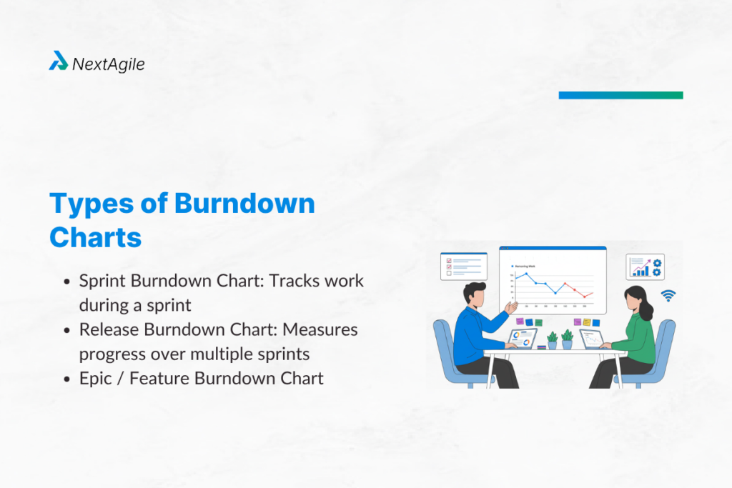
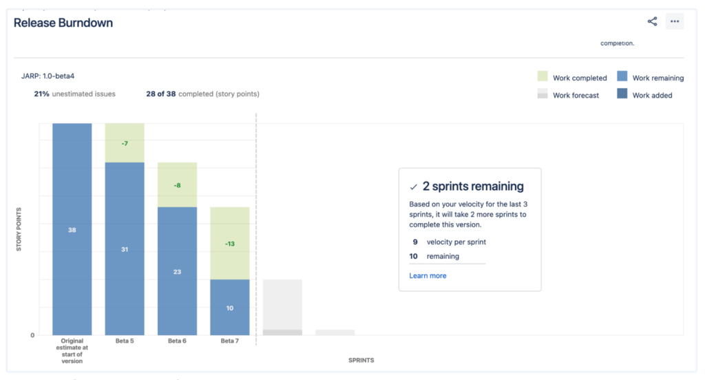
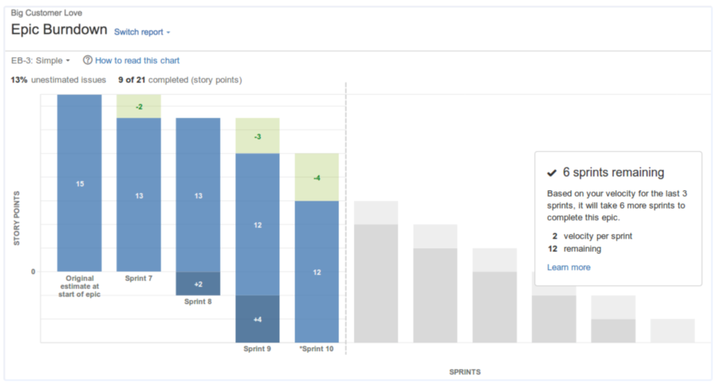
Types of burndown chart
How to create a burndown chart?
Some best practices and pitfalls to avoid with burndown chart
What is a Burndown Chart?
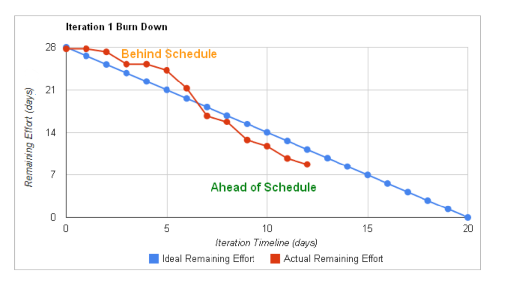
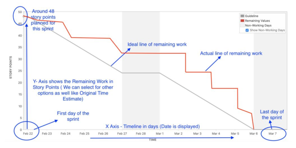
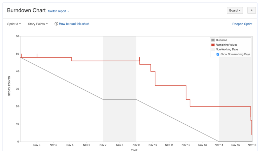
A burndown chart simply is a visual representation of work remaining over time. It maps the work left against the sprint duration. Basically it is an artifact which plots work against time to answer the golden questions:
How much progress have we made?
How much more work is remaining?
Are we on track to finish what we committed to?
What makes the burndown chart uniquely powerful is not the visualization itself, but the frequency at which it gets updated and interpreted. Unlike milestone-based tracking, which offers delayed feedback, burndown charts compress the feedback loop to a daily cadence. This enables teams to detect execution drift early, when corrective action is still inexpensive.
Layman Example: Imagine you have planned to read a 300 page book in 10 days. A burndown chart would plot total pages left after each day. If you finish 30 pages daily, your progress follows an ideal straight line down to zero. But if you skip reading one day or read extra, the actual line shows that deviation.
This example highlights a subtle but important insight: consistency matters more than intensity. Teams often try to compensate for early delays with last-minute acceleration, but burndown charts make it visible that uneven progress introduces risk. Sustainable, incremental completion patterns almost always outperform sporadic bursts of activity.
Why Use a Burndown Chart?
The Burndown chart is not yet another graph. While it has been misunderstood widely as another report in agile, the value is beyond just visualization. One of the biggest shifts in high-performing teams is when they stop reading the burndown chart and start questioning it. Instead of asking “What does the chart say?”, they ask:
What behavior is this chart reflecting?
What system constraint is causing this pattern?
What decision do we need to make right now?
This shift transforms the chart from a reporting artifact into a decision-support tool.
It helps the teams with,
Transparency and Accountability – A burndown chart makes progress visible to everyone in the team. It acts as a single source of truth that shows what has been done and what is left. This helps teams take accountability for what they have committed for
Surfaces warnings early – By showing real time progress of work, the burndown chart can alert the team on potential problems early in the sprint. For example, if your actual line is always above the ideal line, it may be a blocker in the team or maybe your story is too big
Forecasts effectively – Team’s burndown chart over time can become a valuable input for team’s forecasting. By looking at past few burndown charts, teams can get better at estimating, planning, splitting big stories into smaller once and improve predictability
Over time, burndown charts contribute to building a team’s delivery intelligence. Patterns across multiple sprints reveal deeper insights such as estimation bias, dependency bottlenecks, and completion behavior. This longitudinal visibility is what enables teams to move from reactive execution to proactive planning.
 Skip to content